Introduction
The December SIG looked at ways to use selection tools to:
(1) Change the sky back ground
(2) Change the background colour
(3) Ways to create composite images
I amazed at the occasional gem that appears sometime among all the day to day mediocre websites. The one below is an example of one of these gems.
Work flow outline for post production of your images. We always seem to be looking at a different order of steps to follow for enhancing a snapshot. This is a website worth going to have a read.
The steps are the same, ” . . whether it is for a workflow that’s quick and dirty for pictures on a deadline, or it might be a workflow for producing the best possible image, for when quality counts. ”
The website above suggests five stages for your post production image enhancement.
There are five stages to this workflow:
For today, we will just do a simpler method for the down and dirty way.
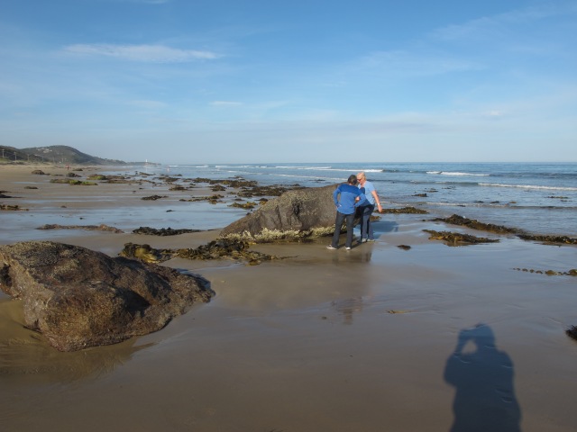
(1) Open up one of your own photos with a boring sky. The one that I am starting with is shown below. It shows the editor walking along the beach with a friend at Eastern view on the Great Ocean Road. The shadow of the intrepid photographer can be seen at the bottom of the snapshot. Here it is.
Image 1 – Editor walking on beach
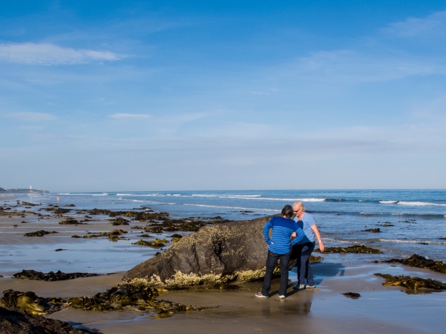
(2) A few steps have been left out here. I opened the image in Adobe Camera Raw using the RAW format from my trusty Canon G12. Next, I used the basic panel to go through some enhancement of the photo. I checked the size of the image (9 x 12 inches). I used the crop tool to change it to a 8 x 6 photo at 300 dpi so that I could print it when finished. Here is the image ready for the next step.
Image 2 – Editor on beach cropped.
Click on image to see in full size.
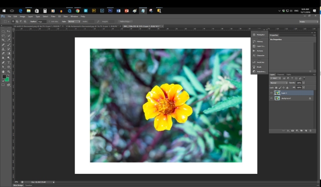
(3) Press Control + J to duplicate the layer.
(4) Click on the Quick Selection tool and use it to select the sky.
(5) Press the Delete button to make the sky disappear.
Introduction
Bill Ellemor was the presenter at the November Photoshop SIG. He was given these questions before hand to use as a starting point for discussion during the SIG. Unfortunately, there was not enough time to go through all of these.
What follows is two things:
– some of the points that Bill went over during the SIG.
– my notes to go along with what Bill explained to us.
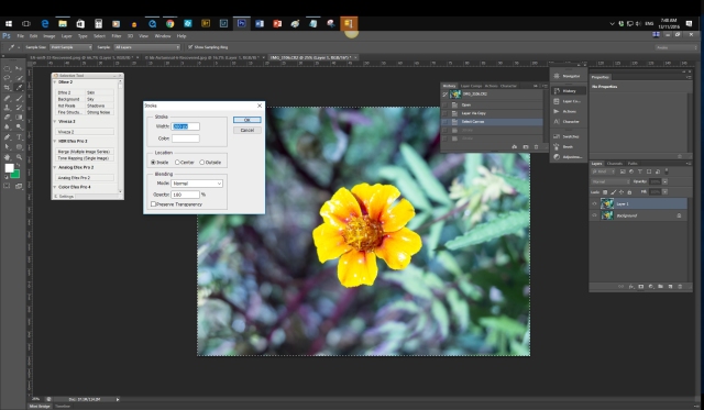
Question 1 – How do you put a frame around a photo?
– Bill Ellemor’s method
(1) Duplicate the layer using Control + J.
(2) Create a new layer by clicking on Layer/New/Layer.
(3) Select all by pressing control + A.
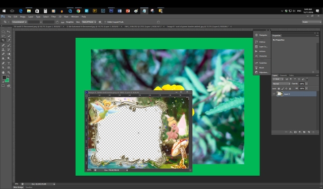
(4) Edit stroke. Here is the image that I am using.
Click on the image to see in full size.
(4) Set these as your choices in the Stroke Box:
Width – 200 pixels
Colour – white (or click on this and chose another color to suit you and your photos).
Location – tick the Inside radio button.
Blending Mode – Normal
Opacity – 100%
(5) Click on OK. Voila! Sort of a frame appears around your image.
(6) If you don’t like it, then press Control +Z to Undo it and have another go.
Question 2 – How can you change the background of a portrait?
Bill Ellemor gave a concise explanation of how to do this.
I feel that this really needs a few minutes spent on revising how to use the PS selection tools before we can get into the changing of the background of the image. This will be the first topic for the December SIG.
Question 3 – How much processing do you do in Camera Raw before importing it into Photoshop?
Bill Ellemor made the following points:
– set your camera to save in both raw and jpg format (RTM).
– PS will open any raw images in Adobe Camera Raw (ACR).
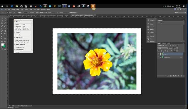
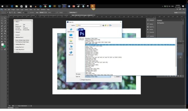
– if your image is in jpg format, then click on File/Open As and then choose the Camera Raw format as shown in the image below:
Click on the image to see in full size.
– use the sliders in the first panel that opens in ACR. You can probably do 80% of your image editing in ACR.
Question 4 – What actions would you recommend for LR and PS?
This was one that we skipped because we were running short on time. My suggestions would be:
– Download and install the free NIK effects for Photoshop (https://www.google.com/nikcollection/) and access these through the filters menu. Tons of fun and will keep you busy for six months.
– With Lightroom just use the existing presets to get started with.
– I have deliberately left out any discussion of Actions for now. These will be covered in the new Lightroom SIG starting in 2017.
Turns out that Questions 6 and 7 are two sides of the same coin. Question 6 – How do you replace the part of a photo, for example, on a mirror that is part of a photo? I think this means how do you replace part of an image with something else. Question 7 – Suggestions for simple ways to combine two or three images to create a composite.
Both of these will be the main part of the discussion for the December SIG.
More ways to create frames for your photos
The following is a gathering of some answers from the internet that you might be able to use if you were not able to attend the SIG on November 5, 2016 at New Hope Baptist Church.
Photo Frames Method 1 – Increase the canvas size to get a white frame
(1) Pick an image that you are happy to work with. No sense in opening an image that you think is a piece of junk.
(2) Do the usual procedure to ensure that you are not working on an original (Copy the file, rename the file, close the original file, write down where you saved the copy to if need be).
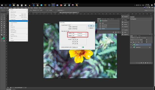
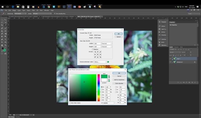
(3) Click on Image /Canvas Size.
(4) Change the Inches to percent.
Click on the image to see in full size.
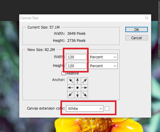
(5) Change the number from 100 to 120 in both the width and the height.
(6) Choose White for the Canvas Extension color at the bottom of the dialogue box.
Click on the image to see in full size.
(6) Press OK. You should get a nice white border around your image.
Click on the image to see in full size.
If it looks out of balance to you, then go back to Inches from Percent and try several different values until you find one that you are satisfied with.
Variation 1 – Change the colour of the frame
(7) Start over again until you get back to Step 5.
(8) Click on the tick box next to where it says Canvas extension colour.
Click on the image to see in full size.
(9) Use the dialogue box to pick a colour that you want to use for the border.
(10) Click OK on the Colour Picker.
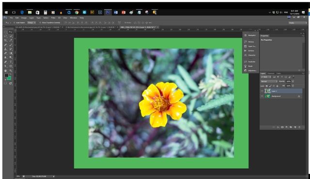
(11) Click on the Canvas Size. Voila!
Click on the image to see in full size.
Variation 2 – Add a fancy border on top of the green canvas border.
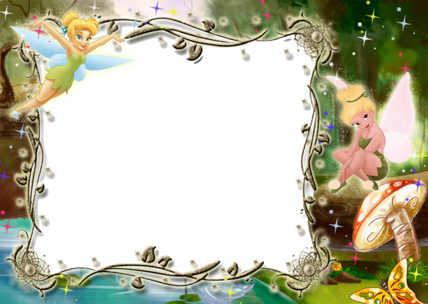
(12) Do a Google image search for frames png. Pick one that is a good size (say 4 MP) to avoid your frame looking pixellated. Here is the one that I am going to use here:
Now I know that you remember how to do this. But just in case, here it is again for a bit of revision.
(13) Save your image from Google.
(14) Open the image in PS.
(15) Press the V key to open up the Move tool. Remember, keyboard short cuts are your friend!
(16) Click and drag the border image down into the work area.
Click on the image to see in full size.
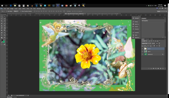
(17) Now click on the tinkerbell border and drag it up into the flower image.
(18) Release the mouse. The flower border appears now as Layer 1 in the Layers panel on the right.
(19) Click the close box on the flower border image .
(20) Press Control + T to bring up the Transform tool.
(21) Drag out the corners of the flower border to match up with the green canvas around the flower image. Looks like this
(22) Well, that is not quite what I expected. Try the different blend modes. I settled for the Lighter Color blend mode so that the green extended canvas can be seen with tinkerbell on top.
More breaking news!
Bill Ellemore is returning as the presenter to answer any and all questions/problems that you have been bothering you.
Please email me (photoshop@ausom.net.au) or just tell me any questions/problems at the start or end of the SIG meeting on October 8, 2016. This will give Bill a head start on what to prepare for.
Introduction
If the notes in this post do not match up exactly with the previous post (what to expect in the October SIG), This is due to the deadline for the article for the AUSOM News being the week before the actual meeting. So everything that you read here is sort of a guess!
The three topics for the October SIG are:
(1) Explanation of the Vibrance tool and how, why and when you can use it.
(2) Adding a bokeh background to your snapshot.
(3) Using the PS blur filter to create a soft out of focus background.
So let’s make a start.
Part 1
The Vibrance tool
Here is the photo that I am starting with in camera raw format:
Vibrance is a smart-tool which cleverly increases the intensity of the more muted colors and leaves the already well saturated colors alone. It’s sort of like fill light, but for colors. Vibrance also prevents skin tones from becoming overly saturated and unnatural.
Another way to describe it is that saturation will boost all the colours in your image until it looks bloody awful and your grand child looks at it and says, “It’s been Photoshopped and looks awful!” So go easy on the Saturation slider.
The vibrance slider is a lot more useful in that it leaves the yellows and orange tones alone and subtly (Note the word – subtly) increases the other colours without it being too obvious. “Gran, what a great photo. How did you do that?” The reply might be, “Just lots and lots of patience, Little Grasshopper.”
So go back to the link above and look at the three variations of the shot of the married couple. Vibrance – good. Excessive saturation – bad!
So here is the image that I started with after a bit of adjustment. I did my usual steps – renamed it, saved as, duplicated the layer, played with blend modes (multiply) and opacity 55%), added a hue saturation adjustment layer (clipped to the duplicate layer), added a frame and did a Save As in jpg format.
Final image after enhancement with the Vibrance too (and a few others as well!). Click on Image to see in full size.
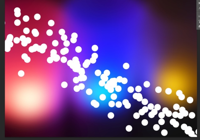
What is bokeh?
This answer is kind of reverse engineered. By the time I almost completed this article I was thinking in term soft, out of focus backgrounds with soft circles of light. How wrong could I be? Really wrong.
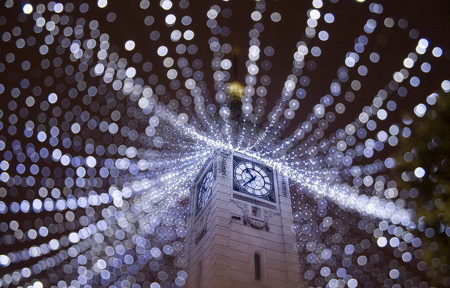
Near the end I searched the Digital Photography School website for “bokeh”. I got 15 hits and some beautiful images to look at. Here is my favourite. The effect can be achieved by using the brush tool in Photoshop. I hope that you will have as much fun with this idea as I have.
Adding bokeh (soft background with light effects) to your photo Putting this part together has been a big help to me.
Before I started I did not realise that there was a difference between bokeh and a softly blurred background. Now I know a little bit more and I hope that I can pass it on to you.
Using Photoshop to create bokeh The first question is how do you pronounce it correctly? We can find the answer to that at this website – https://www.youtube.com/watch?v=OR8HSHevQTM
Bokeh is the term that refers to the aspect of light sources that are blurred in the background or foreground.
Here is an example of a back ground image with bokeh lights.
Click on image to see in full size.
Now let’s use PS to create a back ground. Here is the image that I am starting with. You can download this if you want to follow along.
Starting point for creating a bokeh background. Click on image to see in full size.
(1) Open an image of lights that you have either taken yourself or downloaded from the Internet. I am working in PS.
(2) Duplicate the layer (Control +J).
(3) Click on Filter/Blur/Gaussian Blur.
(4) Move the slider across to create a blurry image that is hard to figure out what it is when you compare it to what you started with. Here is what I have:
Apply a Guassian Blur to the duplicate layer. Click on image to see in full size.
(5) Add a new layer by clicking on Layer/New/Layer.
(6) Press B for your brush tool.
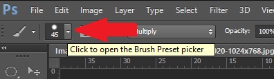
(7) Click on the drop down menu to open the Brush Preset picker.
The red arrow shows you where to click for the Brush controls – size, opacity (100%) and hardness (100%)
(8) Choose a round hard edged brush and set the opacity to 100%.
(9) Set the foreground colour to white.
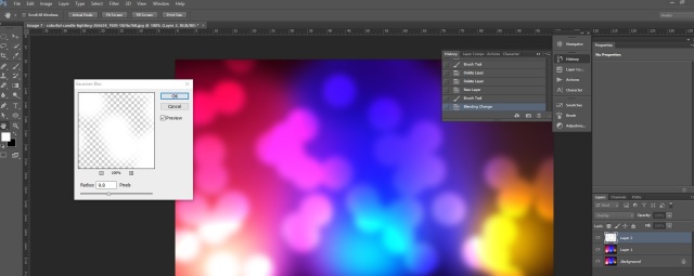
(10) Press the F5 key to bring up the brush dialogue box.
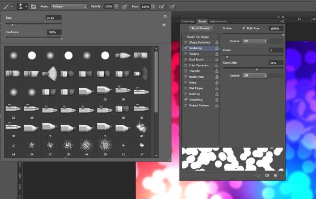
(11) Tick the Scatter to 100 %, Count to maybe 3 or 4 and jitter to 50%
As you make each adjustment you can see how the brush will be affected by looking at the line at the bottom of bottom of the dialogue box. Here is what my screen shot looks like:
Showing the brush and scatter controls.
(12) OK Here goes. Drag your brush diagonally on the image. You should have a scattered layer of white dots on it. Yippee! Arghh. That looks awful.
First try at creating dots.
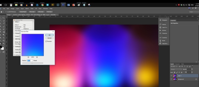
So here is the plan. I am going to make one layer of large circles. Then I’ll set the Blend mode to Overlay. Then I will run a Gaussian blur (Filter/Blur/Gaussian Blur) as we did before. This will give me fuzzy, coloured circles.
(13) Set your brush to 90 pixels.
(14) Swipe your brush once or twice across your image. You can always use Control + Z to undo it if you don’t like it.
(15) Play with the scatter, Jitter and Count controls (F5).
(16) Like it? Good. Choose the Overlay Blend mode.
(17) Now click on Filter/Blur/Gaussian Blur and set the radius to about 10. Here is what I have now:
Second try with larger brush, overlay blend mode and a Gaussian Blur.
(18) Now repeat steps (5) to (17) using a smaller brush size, and a blur radius of about 5 this time.
(19) Repeat Step (18). This time set the blur radius to about 2 or 3.
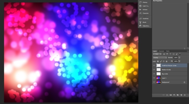
Here is how mine finished up:
Click image to see in full size. Two more layers have been added with smaller diameters for the brush size and the blur radius has been decreased with each one to give a sharper circle.
(20) Flatten the image.
(21) Run a curves adjustment layer on it. Just a slight tweak. The Lighter preset was enough for me.
(22) Thank you WordPress for Auto Save.
(23) Press F5 for your Brush dialogue and untick the Scatter box. Otherwise some very strange things happen the next time that you use your brush.
(24) Here is the picture that I am going to use the bokeh background that I just created to replace the blue sky. This opened in Camera Raw. I used the shot in daylight and the auto commands before importing it into Photoshop.
Photo shot at the Balwyn Fruit and Vegie swap back in May by myself for once. Click on image to see in full size.
(25) Do the usual – rename the image, do a Save As, duplicate the layer, try some blend modes and change the opacity if you want to.
(26) OMG. What is wrong with my brush? Oh. Forgot to change the brush blend mode back to Normal. How did that happen?
(27) Second try. Added the bokeh to the blossom image. Settled for a Blend mode called Color. Dropped the Opacity down to 45%. That looks OK. I’ll stop there for tonight.
Final image – da, da!
Part 3
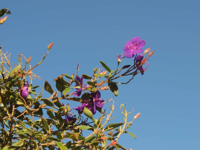
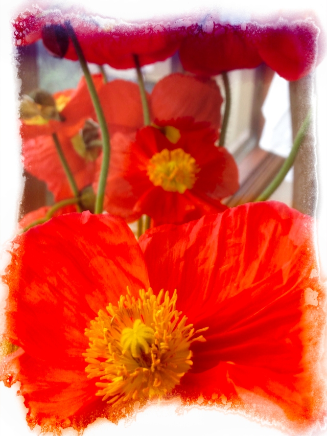
Creating a soft background with your camera. My limited experience has been in taking close up shots of various items with a Canon G12 fixed lens camera. By using Aperture mode and a setting of f2.8, I get a snapshot that is focused on the object but leaves the background as a blur. This helps to draw the attention to the object. So this is a deliberate choice. It took me awhile to get used to comments such as, “It’s out of focus! Go back and try again.” Here is what I was trying to do with a shot of a flower in the image below.
Click on image to see in full size.
I have had some success doing something similar with my iPhone 5C using the Camera+ app which gives me some manual control. You will need to play with it for a while before you get the results that you want. It’s also too easy to hit the Delete button when you were aiming for the Edit button. I wonder if that is a valid excuse to trade up to a newer iPhone. Brad, where are you when I need you!
Some of the things to consider:
(1) Use an aperture as low as possible. My camera only gets down to f2.8. But you work with what you have!
(2) Or you can alternatively just zoom in.
(3) Or just get close to your subject and focus on it. This will make the background look soft and out of focus.
(4) Or try to put some distance between the foreground subject and the background.
Here is an example of a portrait taken in a similar way to give a blurred background.
Send your before and after jpgs to me to post on to the website. My email is photoshop@ausom.net.au.
Conclusion
Hopefully the session on Saturday, October 8, 2016 at the Photoshop SIG has given you a few things to try with your images (Vibrance tool, creating a bokeh background, and using a PS/PE filter to create a soft out of focus background).
I would love to receive some of your before and after shots to put up on the website so that we can add them to the discussion for the next SIG.
Example for October Challenge: Create a bokeh background and then blend it with an image of a flower.
Breaking News
The AUSOM COM and the Photography SIG have arranged for Lightroom to be the topic or the first six meetings of 2017.
Introduction
The Photoshop SIG aims to present a new topic each month to meet requests from its members. This is followed up with a monthly challenge to encourage members to try out what they were shown at the SIG or that they read about on the SIG website.
In general the SIG tries to cover both Photoshop Elements (PE) and Photoshop (PS)
users. However, there may be times when a Photoshop feature is not part of Photoshop Elements.
Last month in the September SIG
(1) We more than doubled our numbers for the September SIG. Just as I was patting myself on the back thinking that I was getting a reputation for being a marvelous SIG leader, one of the new arrivals announced that the iPad SIG had been canceled. So that explained the sudden increase in the number of people at the Photoshp SIG.
(2) Because we had so many new faces, we did a bit of a review of opening an image, duplicating the background layer, and playing with the Blend modes and Opacity slider. This was followed with a brief review of the Shadow and Highlights tool (with the warning that it was a destructive edit and to use it carefully) and the Levels tool from the previous month. We discussed the ways that you could correct under and over exposed images and how to remove or add a colour cast.
The second topic is going to be how to create bokeh in an image with Photoshop. Bokeh is defined as “the visual quality of the out-of-focus areas of a photographic image, especially as rendered by a particular lens.” (From https://en.wikipedia.org/wiki/Bokeh)
Send your before and after jpgs to me to post on to the website. My email is photoshop@ausom.net.au.
Photoshop one on one
If anyone wants to sit down with me for a one on one Photoshop session, please let me know. It’s BYOC. Please email me at photoshop@ausom.net.au to arrange a time, if you interested.
Introduction
There are several different methods that may be used to enhance your photos. This method discussed last month and this month consists of the following order of steps:
(1) Shadow and Highlights tool,
(2) Levels tool
(3) Colour Balance tool
(4) Hue and Saturation tool
(5) Vibrance tool
Introduction
This month’s discussion will be about tools (3), (4) and (5). These are tools in PS/PE that can be used to enhance or correct faults with an image.
Breaking News
There have been requests in both the Photoshop and Photography SIGS to spend some time on an introduction to Lightroom.
This will be done in the first six months of 2017 during the Photography SIG. We are looking for interested parties to run the Intro to Lightroom sessions. Please share your expertise with us.
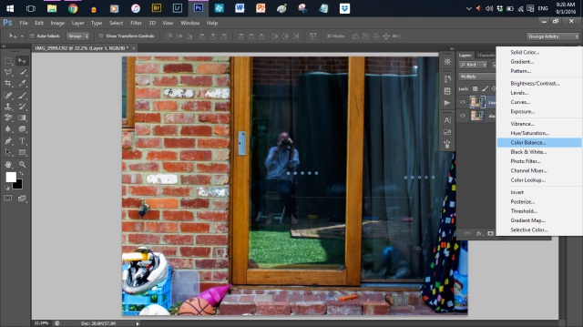
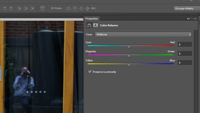
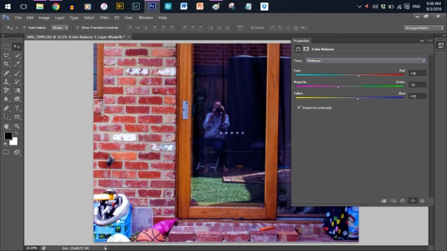
The Colour Balance Tool Let’s start with a short video to get the overall picture (Very punny, Bill.)
(1) Open up you image in PS/PE.
(2) Duplicate the layer using Control + J as a keyboard short cut. I then set the Blend Mode to Multiply to darken the image. I then adjusted the Opacity down a tad
(3) Click on Layer/New Adjustment Layer/Color Balance. Or click on the icon at the bottom of the Layers Tool as shown here:
Click on image to see as full size.
(4) Here is the tool box that comes up in CS6.
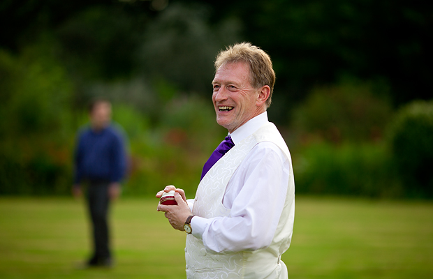
Did you notice the reflection of the handsome photographer?
Well, that was a brief discussion of the Colour Balance tool. Let’s move on to the Hue/Saturation tool.
The Hue/Saturation tool.
Here is a good explanation of why we need something besides just the colour balance tool.
“So far I hope I’ve berated the point that Color Balance is just what name implies, a fine balance. It should be apparent by now that most color adjustments made to the image will directly affect the rest of the color in the image. For example, you can’t seem to increase the amount of Green without decreasing the Magenta in an image.
This problem is called “crossover,” and can be very frustrating if, for instance, you like the amount of Magenta in an image, but want to increase the Green.
Here is a video that shows us how to use the Hue/Saturation Tool like a delicate scalpel rather than a sledge hammer.
Well, I don’t think that I can do any better than that video for a good explanation. So let’s take a photo and give it a try.
(1) Open up a snapshot that you want to enhance,
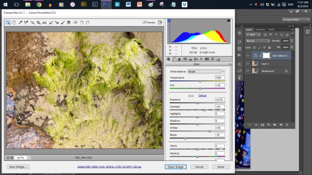
Note: This is a camera raw file that I am using. It opens up in in Adobe Camera Raw. I have chosen Shade as the White Balance and then clicked on the Auto below the top two sliders. This gives me a good place to start. Looks like this:
Click on image to in full size. You may be wondering, “What is that?” A shot of a rock on the beach at low tide with bits of sea weed on it. Followed by, “Why would you take a photo of that?”
(2) Control + J to duplicate it.
(3) Play with the Blend modes and Opacity controls for a bit. I settled for Colour Burn blend mode and 100% opacity.
(4) Save as a .psd version 1 so that you can come back to this as a starting point.
(5) Press control + 0 (zero) to fill your screen.
(6) Click on Layer/New Adjustment Layer/Hue/Saturation.
Conclusion
That’s as far as we got in the last September SIG. That leaves us the Vibrance tool to start the discussion for the October SIG.
Here is a quote from the Digital Photography School listed above that encourages us to strike a balance when we use Photoshop to enhance a photograph:
“Photoshop is the KEY to making your good images look spectacular. Yes, I said “good” images. Photoshop is not about fixing mistakes or trying to rescue a bad shot. It is more about refining your images and making them look amazing without overdoing it.”
There are several different methods that may be used to enhance your photos. This method discussed today consists of the following order of steps:
(1) Shadow and Highlights tool,
(2) Levels tool
(3) Colour Balance tool
(4) Hue and Saturation tool
(5) Vibrance tool
Before and After
Here are the before and after images of a shot with my iPhone 5C last year that I enhanced following the five steps.
Before and After
Before Photoshop enhancement
After Photoshop enhancement
So let’s get started with a deeper look at some of these tools.
The Shadow and Highlights tool
Just as a preliminary thought – you can use the HDR mode on your camera/phone/tablet to bring out all the detail in the shadows.
The Shadows and Highlights tool is a destructive edit. It is not part of the group of non destructive adjustment layers. So before you apply it, make a copy of your background layer.
(1) Open your image in PS/PE.
(2) Duplicate the background layer by pressing Control + J as a keyboard short cut.
(3) Double click on the Layer 1 text and rename it Shadows and Highlights Edit.
(4) Press Enter to accept the new name of your layer.
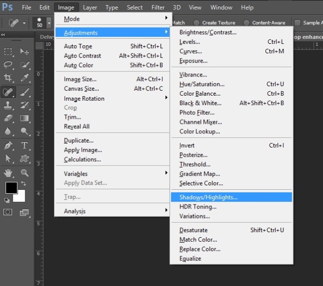
(5) Click on Image/Adjustments/Shadows and Highlights.
Click on Image/Adjustments/Shadows and Highlights
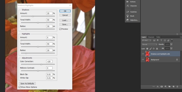
You should get a dialogue box that looks like this. If you have the shortened version, simply click on the Show More Options tick box.
Dialogue Box
According to DPS, this tool is best for bringing out detail in the shadows and not too crash hot on the highlights. So the guide line is only use it for the shadow detail. But do try the highlights and Adjustments sections of the dialogue box. I was presently surprised at how much better the highlights were improved in my snapshot of a flower.
(6) Click on the Preview tick box a few times so that you get used to seeing the before and after effects of your adjustments.
(7) Set the amount to 33% for a start point.
(8) Line up the Tonal Width and Radius sliders with the Amount so that they all read about 33%. Why do it this way? Because it is decreed by the Photoshop gurus.
But this is also a chance to have a play with the sliders and see what effects that you can come up with. You may be surprised like I was.
(9) Now observe the changes in Before and After by trying the Amount sliders at say 50% and 75%. And then vary the tonal Width and the Radius sliders to see what other changes that you come up with and want to keep.
(10) When you use the Amount sliders in the Shadows/Highlights tool, you may lose some saturation. Use the Colour Correction slider in the adjustments part of the panel to increase the saturation to what you had before or even give it a bit more.
(11) Finally, adjust the Midtone Contrast slider and see how it affects or improves your photo.
An aside – As I write this on Saturday, August 6, 2016, I am now using two monitors. The new one actually shows the same colours as the printer. My old monitor was about 12 years old. I never had the motivation to try the whole colour calibration with Spyder and software. Instead I would add a curves layer that would get close to the printer after printing several tries.
I can now report that I wished that I had this a lot sooner.
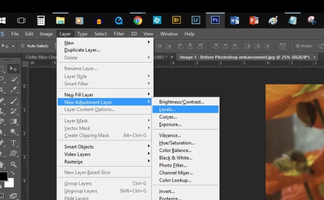
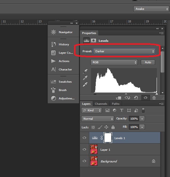
Using the Levels tool
Die hard Photoshop fans will always argue over which is the better tool – Levels or Curves.
Today we will have a look at using the levels tool to control the contrast/Exposure in your snapshot and to adjust the colour as well.
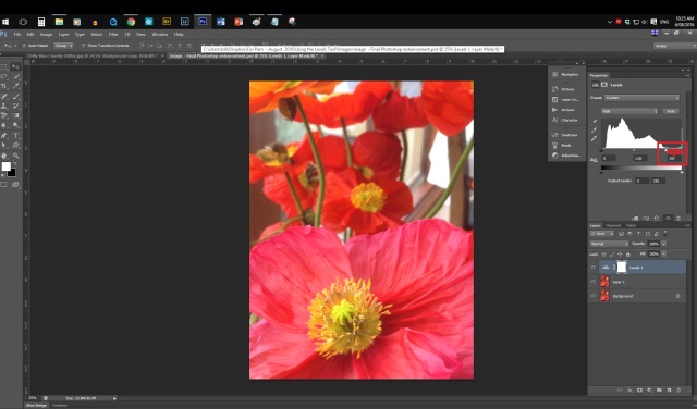
Here is the photo that we were using before with the Shadows/Highlights tool.
Before Photoshop enhancement
Adding an Adjustment layer
(1) Click on Layer/New Adjustment Layer/Levels. Looks like this:
Adding an adjustment layer
The first thing to play with is the Presets.
(2) Click on the Drop down arrow as shown below and select Darken.
Using the Presets (shown in the red outline) in the Levels tool.
(3) Use your up and down keys to cycle through the eight choices so that you can compare the results.
The only problem with this is trying to remember which one that you liked better. Eventually you can get it down to one or two choices. I settled for the Increase Contrast 3 Preset.
(4) You can also click on the Auto button to see what photoshop thinks is best for you. You generally conclude that photoshop has very poor judgement compared to your own selection. Have faith in yourself!
(5) Compare the before and after by clicking the Eyeball of Death next to the Levels Layer on the left.
About the Histogram (the white blobby thingamajig)
Here is an explanation from Sean McHugh’s Cambridge in Colour website (http://www.cambridgeincolour.com/)
The levels tool can move and stretch brightness levels in a histogram using three main components: a black point, white point and midtone slider. The position of the black and white point sliders redefine the histogram’s “Input Levels” so they are mapped to the “Output Levels” (default is black (0) or white (255), respectively), whereas the midtone slider redefines the location of middle gray (128). Each slider is shown below as they appear in Photoshop’s levels tool, with added blue labels for clarity:
Some of you may have noticed a similar graph on the back of your camera when you take a photo. It can be used to help set your camera to the best exposure. You can get more info on this from the Photography SIG members for the price of a cup of coffee. Or better yet for free.
Failing that, then try these two websites for a bit more information than you might want:
(6) Do it yourself! Click on the right triangle on the right and slowly drag it back to the left until you get to the start of the hill. You should see a dramatic change. Hopefully! here is my photo again.
Click on image to see full size. it shows adjusting the white set point by moving it to the left.
The slider on the left is for the blacks. It starts at a value of 0. The midtones have an initial value of 1.0 and the whites start off at 255.
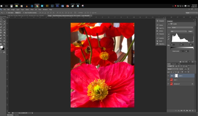
(7) Repeat this for the black slider on the left.
(8) Now the same again with the mid tones slider. Here is what I finished up with:
Black as 10, Mid-tone as 0.76 and Whites as 205.
If you are looking at this on the website, you can see the increase in the colour saturation.
So that is the first part of using the Levels tool to change the contrast across one of your photos when it is over or under exposed. The next task of the Levels is to do some colour correction. Here’s how.
Colour Correction with the Levels tool
Back at the start of this article, we mentioned the Presets may be all that you need. If you want to take it a bit further, then we do the same tasks with the sliders again. But now we use the Red, Green and Blue channels for this.
Conclusion
I hope that this article will get you started using the Shadows/Highlights tool for a quick and easy starting point to enhance your photos.
Introduction
The main topic was meant to be how to change a photo to a line sketch. Turns out that this will only take 30 minutes to explain. The remaining time will be used for questions and answers and discussion of solutions to individual problems.
Topic 1 – Changing an image to a line sketch suitable for framing Many people have a problem similar to mine – I cannot draw very well. In fact, I draw really badly.
Photoshop has come to the rescue for people like me. It is possible to use PS/PE to convert a photo to a line sketch.
But I still prefer something that I can read at my own pace or even more radical – print it and hold it in my hands and turn the pages. How good is that! And how old does that make me? Here is the website that I felt most comfortable with: http://www.graphic-design.com/Photoshop/pencil_sketch/.
To quote from the website:
Tim Shelbourne writes… Ask any artist and they’ll tell you that all the tubes of paint in the world cannot replace the simple pencil when it comes to artistic potential. Through the centuries, the litmus test of an artist’s ability was demonstrated best through the medium of drawing. In days of yore, student painters spent years drawing with graphite to hone their skills.
The so-called “Sketch Filters” in Photoshop consistently yield very disappointing results; re-creating the quintessential sketch demands a little more inventiveness and an approach that mimics traditional techniques. Pencil sketches work especially well when very soft leaded pencils are used on a tinted paper, with a few touches of white chalk here and there to heighten the tones. This is what we’ll produce here, digitally.
Don’t worry if your drawing abilities aren’t up to snuff, all that’s required here is the ability to scribble!
So let’s get started.
(1) Open up one of your photos.
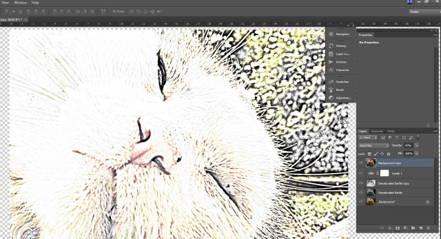
I am using a picture of the family cat. This month his nickname is Garfie Barfie since I seem to have been overfeeding him. He has worked out that all that he needs to do is to keep yowling and sit next to his food bowl and that I will top it up just to get him to be quiet. Here he is.
Garfie Barfie after a few weeks of overfeeding.
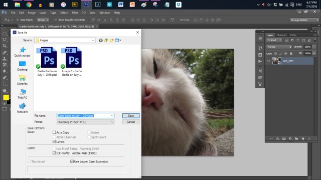
(2) Now give the file another name and save it as a .psd some place that you can find it easily. Mine is named Garfie Barfie on July 1, 2016 and saved to July SIG Notes/Images.
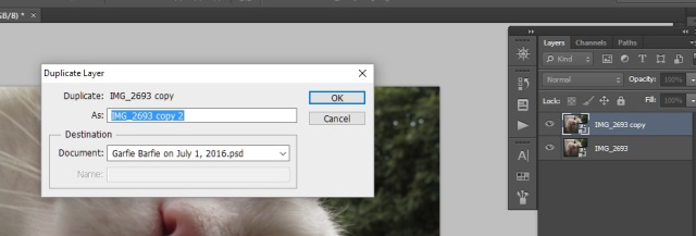
(3) Duplicate the layer by clicking on Layer/Duplicate Layer.
(4) Click OK when the dialogue box comes up. It looks like this:
Click on image to see in full size.
Or you can use the keyboard shortcut of Control + J to do the same thing.
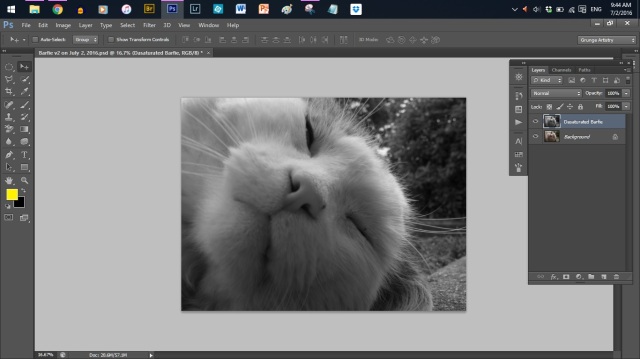
(5) Desaturate the duplicate layer (remove any colours other than black, white and shades of grey) the layer by clicking on Image/Adjustments/Desaturate.
Or you could use the keyboard shortcut of Control + Shift+ U.
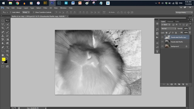
(6) Double click on the duplicate layer and rename it as Desaturated Barfie. Now it looks like this:
Click on image to see in full size.
(7) Duplicate the Desaturated Barfie layer by pressing Control +J.
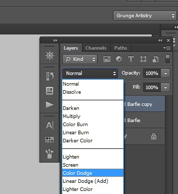
(8) Change the Blend mode to Colour Dodge. Here is what we have now:
(9) Invert the layer by clicking on Image/Adjustments/Invert. The image will disappear.Do not pull out your hair. It is meant to look like that.
You know what to do! Click on the image to see it in full size.
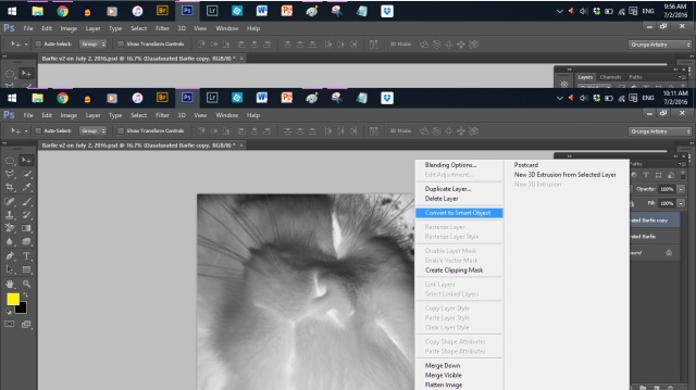
(10) The next step might need a few tries. So let’s change the layer to a Smart Object. Right click on the top layer and choose Convert to Smart Object. This will let us come back and make any changes to the filter we are about to add. Looks like this:
Click on the image to see in full size.
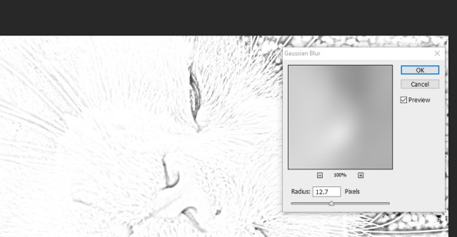
(11) We want to apply a Gaussian blur next. Click on Filter/Blur/Gaussian Blur. Make sure the Preview box is ticked.
Click on image to see in full size.
(12) Move the slider back and forth until you reach the result that you want. The effect that you want is that of a pencil sketch rather than a photograph.
(13) To make the lines darker and thicker, add a levels adjustment layer by clicking on the icon in the blue square shown below.
(14) Move the slider shown in the red rectangle over to the right to increase the density of the sketch lines.
That pretty well completes the photo to sketch that we set out to try.
If we want to add a bit of colour to it, this is easily done.
(15) Click on the original background later that you started with to make it active.
(16) Duplicate the layer by pressing Control + J.
(17) Now drag the Background Copy up to the top of the layers.
(18) Change the opacity to get a mix of colour and the sketch effect.
(19) Finally, cycle through your blend modes until you find one that you like. Here is what I finished up with:
Barfie after duplicating the background layer and moving it to the top of the stack. then adjusting the opacity and Blend mode to get my final coloured sketch.
Conclusions
First, I would pick an image of something other than a white furry cat. There is just not enough contrast to in the image that I chose to get a good sketch effect.
Second, it was both frustrating and helpful to find there are so many different ways of getting this effect. The smart filter meant that I could go back and make adjustments to the Blur filter without losing the rest of the effect.
Third, I hope that you will have a chance to give this a go. I have learned heaps trying as well as horrifying friends that let me take their portrait and wind up looking like the Serial Killer/Music Star segments shown in the Spicks and Specks music quiz show on the ABC.
I realise now that it will take a lot more effort and time to produce a better effect that will be more flattering than my present attempts.
But as the stock car race driver said after spinning out his car and rolling it several times, “Wow! What a ride.”
Introduction
The Photoshop SIG aims to present a new topic each month to meet requests from its members. This is followed up with a monthly challenge to encourage members to try out what they were shown at the SIG or that they read about on the SIG website.
In general the SIG tries to cover both Photoshop Elements (PE) and Photoshop (PS)
users. However, there may be times when a Photoshop feature is not part of Photoshop Elements.
In the May SIG
(1) We began with a demo of what you can do with some of the NIK effects available for free from Google (https://www.google.com/nikcollection/).
(2) Next we looked at how to use Adobe Camera Raw (ACR) to make initial adjustments to an image before bringing it into PS or PE. We looked at how to use either Lightroom, PS, or PE to open an image in ACR.
(3) Then there was a demo of using the basic editing page in ACR to enhance an image.
(4) Lastly, we looked at how to make a selection and then what to do with it once we had selected it.
I hope that you have a chance to try these tutorials and share your experiences with each other at the June SIG meeting.
Photoshop one on one
If anyone wants to sit down with me for a one on one Photoshop session, please let me know. It’s BYOC. Please email me at photoshop@ausom.net.au to arrange a time, if you interested.
Notes: (1) These can be found online in a slightly different format (with cartoons!) at https://2014photoshopsig.wordpress.com/.
(2) Thanks again to the Harvest Bakery in Balwyn for their kind donation of goodies for morning tea at the Retirees SIG.
Finally, most of my information for the topics of selections, channels and masks comes from a good online course by David Cross. A bit pricey at $US 97, but well worth the money. Find out more at https://fineartgrunge.com/selections/.
Why selections?
(1) They let you isolate a part of an image so that you are working only on the isolated area. Once selected, the area stays selected until you deselect it (Control + D). This means that you cannot get any other tools to work until it is deselected. Another way to deselect is to click once outside the selected area.
(2) Making a selection is the first step in a series of what you may have planned.
(3) Better yet, any selections that you make can be saved and loaded at a later step. This involves the use of channels. (Select/Save Selection). Another topic for July perhaps.
(4) The selection can be turned into a layer mask. Another possible topic for July, perhaps?
(5) Use channels to make a selection instead of one of the usual tools such as the rectangular marquee tool.
If you seem to be coming up with a strange selection time after time, make sure that the Style box is set to Normal rather than Fixed Size.
What does that little box marked feathering do?
Feathering allows you to set a degree of blur to the selection of your edges. This can be good and bad. The bad part is that it is a destructive edit. Once you have done it, it cannot be undone. So use it carefully.
Using the marquee tool
(1) Holding down the shift key at the same time that you click and drag out your selection will give you a perfect square/circle.
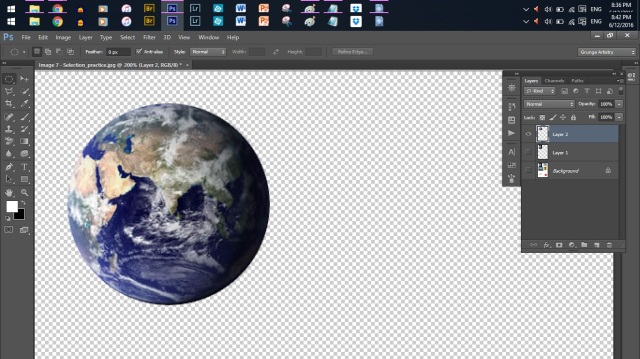
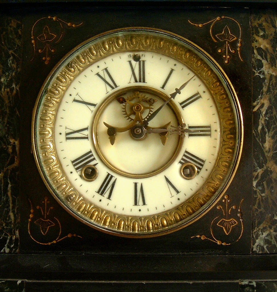
(2) Most of the time you drag diagonally. However, there are times when you might want to draw outwards from the centre, such as when wanting to select the face of a clock. To do this, hold down the Alt key as well as the Shift key. Voila!
Click here to download a clock face to practice on (upon which to practice?).
(3) Did you draw your selection in the wrong spot? Before releasing your mouse button (hopefully), hold down your space bar and you can move your selection to a new location. Then release your mouse button!
Using the lasso tool
(1) Remember that as soon as you let go of the mouse button, the lasso will automatically go to the starting point to close the selection. This can be both good and bad. Bad in the sense that you were not expecting it to close by itself. Good in the sense that there is nothing to double click to get it to close as with some of the other tools.
(2) Do not waste your time trying to draw around the outline of a shape to select it. That is not how to use the Lasso. Use it to improve a selection that needs something added or subtracted to it.
Using the polygonal tool
(1) Use this for when you have a lot of straight edges.
(2) As you get closer to your starting point, you will see a small circle apear as part of your cursor. Looks like this:
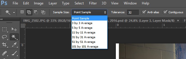
Using the Magic Wand tool
This used to be the most popular selection a few years ago. We’ll have a brief look at to discuss the constraints in the tool bar – sample size, tolerance, anti alias, and contiguous. These are shown in the image below:
The magic wand tool makes a selection based on the pixel colour rather than click and drag as we have done with the Marquee tools. If you start with a Point Sample, you may only get a few pixels selected. you can improve on this by normally using a 3 by 3 Average.
The next box is your tolerance range. The higher that the number is, then the more pixels are selected. but as a guideline, keep the tolerance low. The upper end is 256 which gives the same result as Select All.
If you have any curves as part of your selection, then you want to have the Anti-alias box checked. This tells PS/PE to smooth out the edges of the curved section.
If you want to select pixels that lie next to each other, then tick the contiguous box. The definition of contiguous means next to each other. It’s not one of those words that you can drop into your cocktail party conversations, is it?
But in general, you will be better off using the Quick Selection Tool. So let’s look at it next.
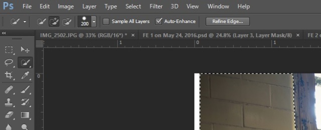
Using the Quick Selection Tool
The Quick Selection tool differs from the Magic Wand tool in that it detects edges rather than pixel colours. Here is what the toolbar looks like:
(1) Leave the Auto Enhance box ticked for most of your work. If you have a really large file, and the processing bar comes up and takes a while to complete, then it is time to untick the Auto Enhance button.
(2) Leave the Add Selection button (the one with the paintbrush and the plus sign) selected.
(3) You can make your brush larger/smaller by using the square bracket keys. “[” for smaller and “]” for larger.
(4) We will discuss the Refine edge option later on.
Using the Pen Tool (Either Oh boy! or Arghhh!)
The Pen tool has caused more angst than any other Photoshop feature. PE users need not worry because as far as I know, it is not in PE.
But the best exercise that I have come across is at: http://design.tutsplus.com/tutorials/photoshops-pen-tool-the-comprehensive-guide–psd-718.
Download the practice file and become better with the pen tool by doing rather than just reading.
Tweaking your selection for the bits that need to be added or subtracted
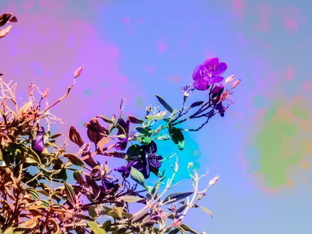
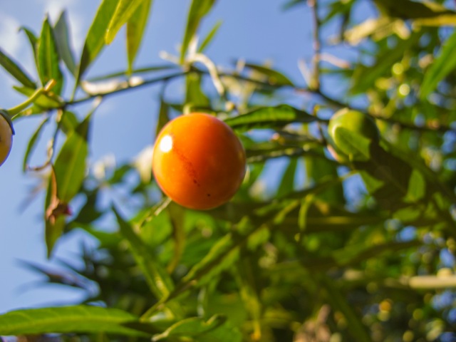
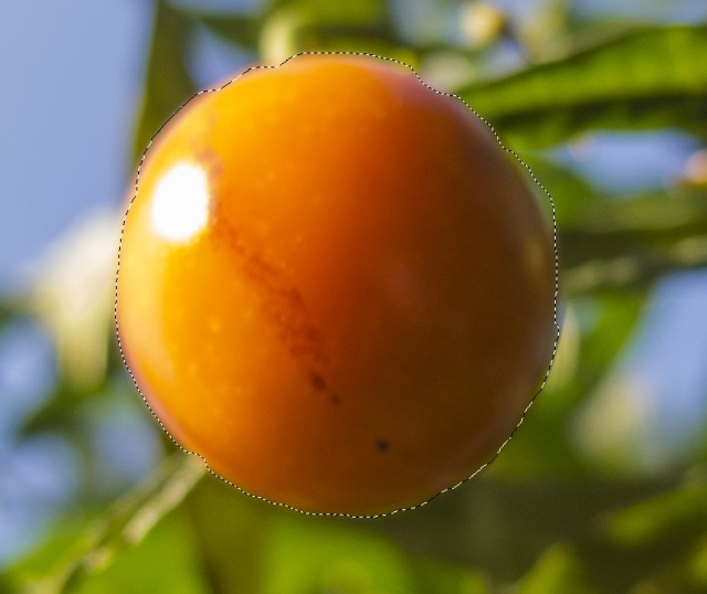
If you hold down the shift key, you will be adding to your selection. And if you hold down the Alt key, then you will be subtracting from your selection. Let’s try it with the image below. You can click on the image and download it to your own computer.
(1) Any suggestions for which tool to try and use to select the orange coloured berry? There is a hint in there for you – the word “colour.” Good. You suggested the Quick Selection (QS to make life a bit easier) tool. Well done!
(2) I need to zoom in on the photo to make it easier to see my selection with the QS tool. I hit Control and + on my keyboard to get the image up to 67% where I can see it all right. This is difficult to do on your iPhone screen!
(3) To move around the image, press the space bar down as you click and drag with your mouse.
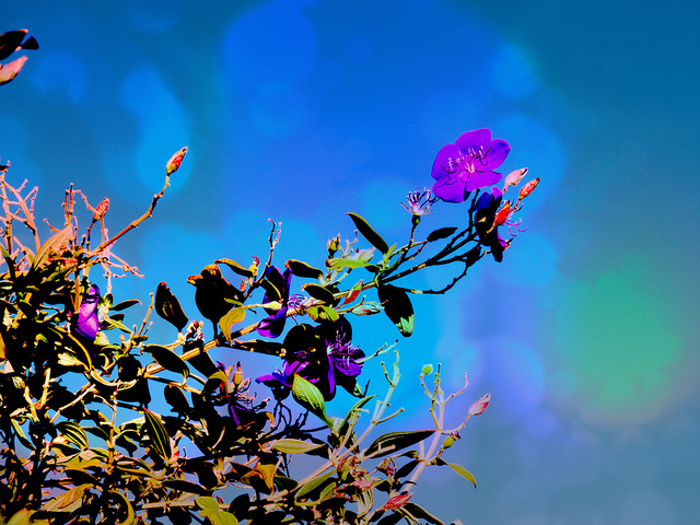
(3) After using the QS, this is what I have selected.
It looks a bit lumpy! So we need to tweak it a bit using the Lasso tool and the shift and alt keys.
(4) Zoom in even more. Note that if you lose your selection, then click on Select/Reload to get it back.
(5) Click on the Lasso tool. When I hold down the Shift key, the cursor changes and now has a + as part of it. When I hold down the Alt key, the cursor now ha a – as part of it.
(6) This is going to have to be a demo. It is not possible to get a screen shot to show you. So we can watch the first three minutes of this video clip from: https://www.youtube.com/watch?v=UvUt-o-URxc
Putting it all together
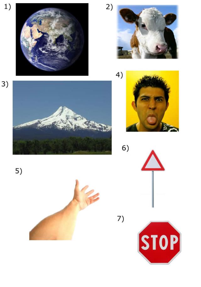
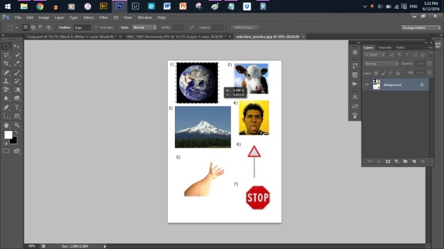
(1) Go to this website and download the image to your computer.
(2) Open the image in PS/PE.
(3) Press control + J to copy the image. (So that you can always go back to your original photo.)
(4) Use the rectangular Marquee tool to select Figure 1 of the moon. It Looks like this:
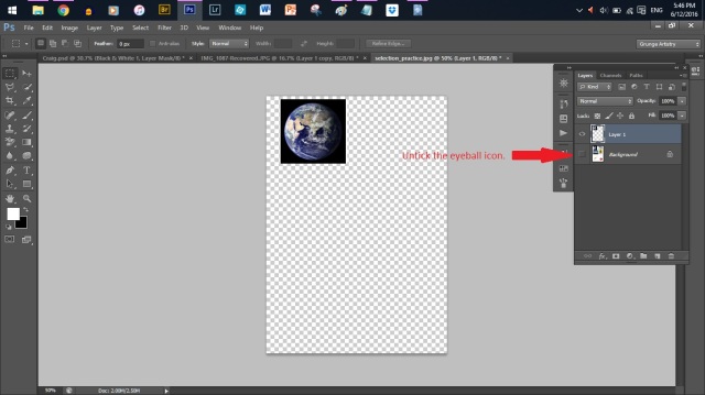
(5) Now press Control + J to get a copy of the image on another layer.
(6) Now turn off the Eyeball in the background image. You should have something that lo0ks like this.
Click here to see in full size.
(7) Now that you have the moonimage selectefd on its own layer, use the elliptical marquee to select the moon.
(8) Now use Control + J to put the moon selection onto its own layer. Voila! You have done it. It should look like this:
Image 10 – Moon selection placed onits own layer.
(9) Now use a variety of the selection tools to put each of he remaining images onto a separate layer.
In conclusion, I hope that this has started you on the path to being able to use selections as part of your plans to enhance your images.
But there is also the easier way of using the presets in Lightroom to accomplish something similar. This might be a topic for August?
That’s it for this month.
I’m always interested to hear what you are doing from the comments that you make in the blog pages.


